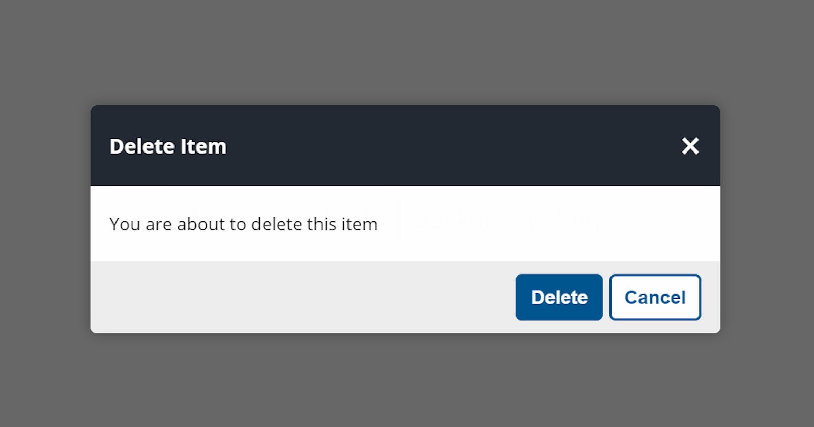
Hello Guys, Its me (Zino) again. Today I would show you how I created a custom confirm box using ES6 classes.
This is something you must know as a web developer and I will do my best to explain it very clearly, like I did in my 100 Days of JavaScript Course. Feel free to check It out.
What is a confirm box? A confirm box is a dialog box that gives a user the option to either execute or cancel an action.
A good use case for a confirm box is when a user tries to delete data on their dashboard. It makes sense to interrupt such action with a confirm box especially if the data cannot be recovered after deletion.
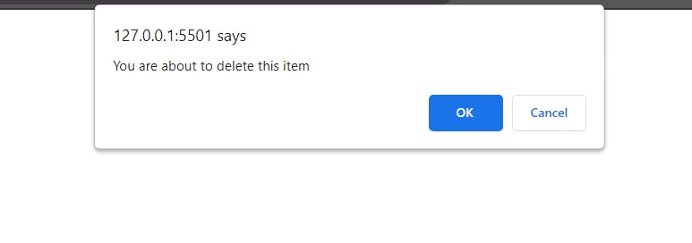
Having said this, JavaScript has a native confirm box which can be called using the confirm() method.
window.onload = () => {
  confirm("You are about to delete this item");
};
This is what the default confirm box looks like.
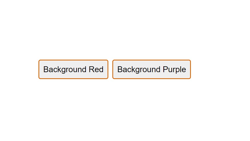
Now let's see how we can create a custom confirm box. We are going to take a simple approach to this project by creating two buttons that would change the background color of the page to red and purple. Don’t worry, with the explanation I give, you can apply the same principle for any action.
So,
- We would create a page with two buttons
- We would create a modal (pop-up box) that would be initially hidden
Here is the markup.
<!DOCTYPE html>
<html lang="en">
<head>
<meta charset="UTF-8" />
<meta name="viewport" content="width=device-width, initial-scale=1.0" />
<title>Document</title>
<script
src="https://kit.fontawesome.com/1935d064dd.js"
crossorigin="anonymous"
></script>
<link rel="stylesheet" href="styles.css" />
</head>
<body>
<section class="main">
<button id="btn-1">Background Red</button>
<button id="btn-2">Background Purple</button>
</section>
<div class="confirm close-modal">
<div class="confirm-modal">
<div class="header">
<span class="title">Delete this item</span>
<button class="close">×</button>
</div>
<div class="content">You are about to delete this item</div>
<div class="buttons">
<button class="btn btn-ok">Ok</button>
<button class="btn btn-cancel">Cancel</button>
</div>
</div>
</div>
<script src="script.js"></script>
</body>
</html>
Here is the CSS
@import url("https://fonts.googleapis.com/css2?family=Open+Sans:wght@300;400;600;700&display=swap");

:root {
  --white: #fff;
  --black: #1c2b2d;
  --blue: #31326f;
  --light-blue: #005490;
  --color-primary: #9d0191;
  --color-sec: #db6400;
  --color-grey: #eee;
  --color-dark-grey: #222831;
}

* {
  margin: 0;
  padding: 0;
  box-sizing: border-box;
}

html {
  font-size: 10px;
}

body {
  font-family: "Open Sans", sans-serif;
}

p {
  font-size: 1.6rem;
  line-height: 1.5;
}

img {
  width: 100%;
}

.container {
  max-width: 900px;
  margin: 0 auto;
  padding: 0 20px;
}

/* Start Here */
.main {
  width: 100%;
  height: 100vh;
  display: flex;
  justify-content: center;
  align-items: center;
}

#btn-1,
#btn-2 {
  padding: 1rem;
  font-size: 2rem;
  cursor: pointer;
  margin: 0 5px;
  border: none;
  outline: none;
  border-radius: 5px;
  border: 2px solid var(--color-sec);
}

.confirm {
  position: fixed;
  top: 0;
  left: 0;
  width: 100%;
  height: 100%;
  background: rgba(0, 0, 0, 0.6);
  padding: 10px;
  opacity: 0;
  animation: open 0.2s forwards;
  display: flex;
  align-items: center;
  justify-content: center;
}
@keyframes open {
  from {
    opacity: 0;
  }
  to {
    opacity: 1;
  }
}

.confirm-modal {
  width: 100%;
  max-width: 50rem;
  background: var(--white);
  font-size: 1.4rem;
  border-radius: 5px;
  overflow: hidden;
  box-shadow: 0 0 10px rgba(0, 0, 0, 0.3);
  opacity: 0;
  transform: scale(0.75);
  animation: open-modal 0.2s forwards 0.2s;
}

@keyframes open-modal {
  to {
    opacity: 1;
    transform: scale(1);
  }
}

.close-modal {
  display: none;
}

.header {
  background: var(--color-dark-grey);
  color: var(--white);
  display: flex;
  align-items: center;
  justify-content: space-between;
  padding: 1.5rem;
}

.title {
  font-size: 1.6rem;
  font-weight: 700;
}

.close {
  background: none;
  outline: none;
  border: none;
  font-size: 3rem;
  color: #ffffff;
  cursor: pointer;
  transition: color 0.15s;
}

.close:hover {
  color: red;
}

.content {
  padding: 2rem 1.5rem;
}

.buttons {
  background: var(--color-grey);
  display: flex;
  justify-content: flex-end;
  padding: 1rem 1.5rem;
}

.btn {
  padding: 8px 1rem;
  border: 2px solid var(--light-blue);
  border-radius: 5px;
  background: var(--white);
  color: var(--light-blue);
  font-weight: 700;
  font-size: 1.5rem;
  margin-left: 5px;
  cursor: pointer;
  outline: none;
}

.btn-ok {
  background: var(--light-blue);
  color: var(--white);
}
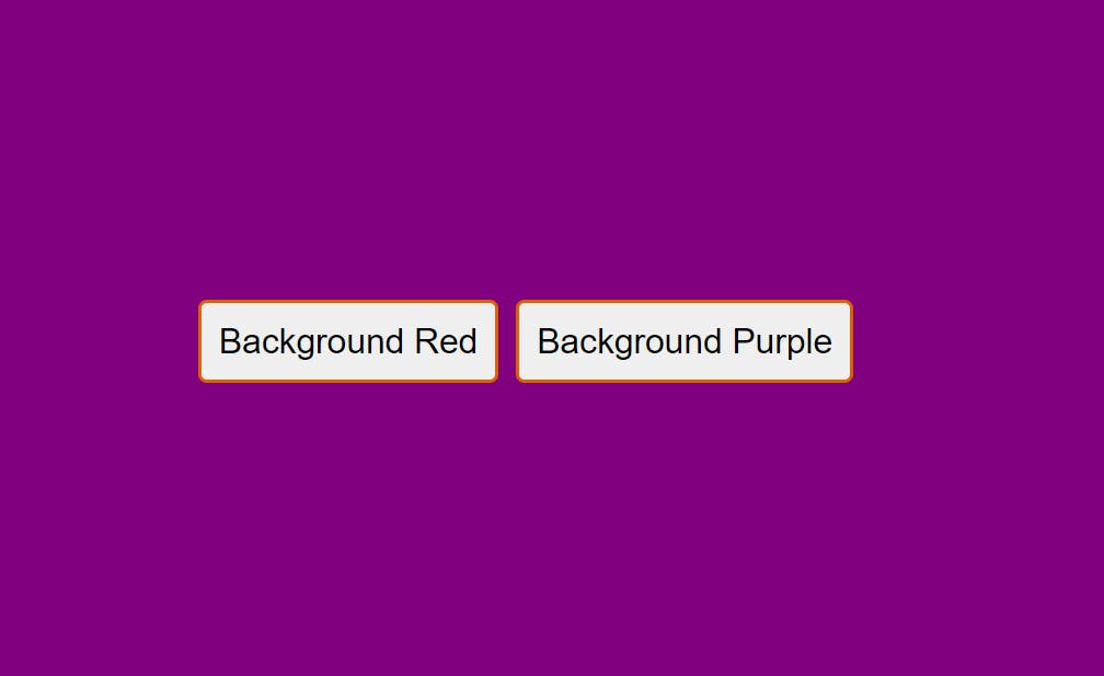
Here is our page
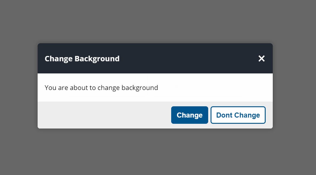
Here is the modal when opened
Now it's time for the JavaScript Logic to this project. As I said, we would be using ES6 Classes for this project.
But, please permit me to do a quick revision of ES6 classes. Here are some(NOT ALL) points about ES6 classes.
- A Class is a template for creating objects.
- They are created using the “class” keyword
- A class should have a constructor method. This is where you initialize its properties.
- A class can have any number of methods. A method is simply a function inside a class.
- You can create an object from a class using the “new” keyword.
Now lets see the class syntax
class Person {
  //A popular JS convention is to capitalize the class name
  // The constructor method with the properties inside it
  constructor(firstName, lastName) {
    this.firstName = firstName;
    this.lastName = lastName;
  }

  // A method that returns the fullname of the person
  fullName() {
    return `${this.firstName} ${this.lastName}`;
  }
}
Now let's create a new Person object and call the fullName method.
const person1 = new Person("Akpareva", "Ewomazino");
console.log(person1.fullName());
// output = Akpareva Ewomazino
Now, let me quickly say that this is not all there is about ES6 classes, but it is sufficient for our project.
Back to our project Let’s list out what we want to achieve in this project.
- We want to display a custom confirm box when the user clicks on the button.
- We want to give the confirm box a custom title and message
- We want to execute or cancel the interrupted action depending on what the user clicks on the custom confirm box.
- We want to close the confirm box when the close icon is clicked.
Now, let’s get started by creating variables that would target all the components on the DOM that we would need for this project.
const btn1 = document.querySelector("#btn-1");
const btn2 = document.querySelector("#btn-2");
const confirmEl = document.querySelector(".confirm");
const title = document.querySelector(".title");
const message = document.querySelector(".content");
const btnClose = document.querySelector(".close");
const btnOk = document.querySelector(".btn-ok");
const btnCancel = document.querySelector(".btn-cancel");
Next, let’s create a class named “ShowConfirm” and create a constructor method that contains four properties (title, message, ok, and cancel).
class ShowConfirm {
  constructor(title, message, ok, cancel) {
    this.title = title;
    this.message = message;
    this.ok = ok;
    this.cancel = cancel;
  }
}
Next, let's create a method named “trigger” that would trigger the confirm box on click and handle the UI and events associated with the confirm box. The trigger method is also going to take a callback. By the way, a callback is a function passed as an argument to another function.
We would also create a “closeModal” method that would imply close the modal when the close icon is clicked.
class ShowConfirm {
  constructor(title, message, ok, cancel) {
    this.title = title;
    this.message = message;
    this.ok = ok;
    this.cancel = cancel;
  }

  trigger(callbackFn) {
    title.textContent = this.title;
    message.textContent = this.message;
    btnOk.innerText = this.ok;
    btnCancel.innerText = this.cancel;

    confirmEl.classList.remove("close-modal");

    btnClose.addEventListener("click", this.closeModal);
    btnCancel.addEventListener("click", this.closeModal);

    btnOk.addEventListener("click", () => {
      callbackFn();
      this.closeModal();
    });
  }

  closeModal() {
    confirmEl.classList.add("close-modal");
  }
}
Next, let’s create an object using the class we just created.
const changeBgObject = new ShowConfirm(
  "Change Background",
  "You are about to change background",
  "Change",
  "Dont Change"
);
Next, let's create a function to change the background color. This function would call use the new object we created above to call the ShowConfirm trigger method that would open the custom confirm dialog box.
const changeBg = (color) => {
  changeBgObject.trigger(setBg);
  function setBg() {
    document.body.style.backgroundColor = color;
  }
};
Lastly, let’s add event listeners on the buttons.
btn1.addEventListener("click", () => {
  changeBg("red");
});
btn2.addEventListener("click", () => {
  changeBg("purple");
});
And now we have our functional custom confirm box.
The good thing about this confirm box is that we can use it in different scenarios throughout our application. An example would be when a user tries to delete data. All we need to do is create a new object using the ShowConfirm class and follow the steps above.
Thanks for reading this article. if you enjoyed it, feel free to connect with me: Website: ZinoTrustAcademy.com
Twitter: @ZinoTrust
YouTube: ZinoTrust Tutorials
